Data visualization is a powerful tool for effectively communicating information. When data is presented visually, it becomes easier for people to understand complex concepts and make informed decisions. However, it is not just about presenting data in any form; it is equally important to use best practices to create visually appealing and informative visualizations. By doing so, we can capture the attention of our audience and convey our message more effectively. In this blog post, we will explore the importance of data visualization and how using best practices can enhance the impact of our visualizations.
Understanding the Data
Before diving into designing visualizations, it is crucial to have a solid understanding of the data you are working with. Comprehending the data ensures that your visualizations accurately represent the information you want to convey. Here are some key steps to consider when analyzing and cleaning your data:
1. Analyzing the Data: Take the time to explore your dataset thoroughly. Look for patterns, trends, and outliers that may influence your visualization choices. This step will help you identify any data quality issues and determine the key insights you want to highlight.
2. Cleaning the Data: Data analytics consulting involves removing duplicates, handling missing values, and correcting any errors. By ensuring the accuracy and completeness of your data, you can avoid misleading visualizations. Use appropriate techniques such as imputation or removal to handle missing data, and verify the integrity of the dataset after cleaning.
3. Identifying Key Insights: Once you have a clean dataset, focus on identifying the most important insights to convey through your visualizations. This involves understanding the purpose of your visualization and the target audience. Select the most relevant data points that support your message and exclude any extraneous information that might distract or confuse viewers.
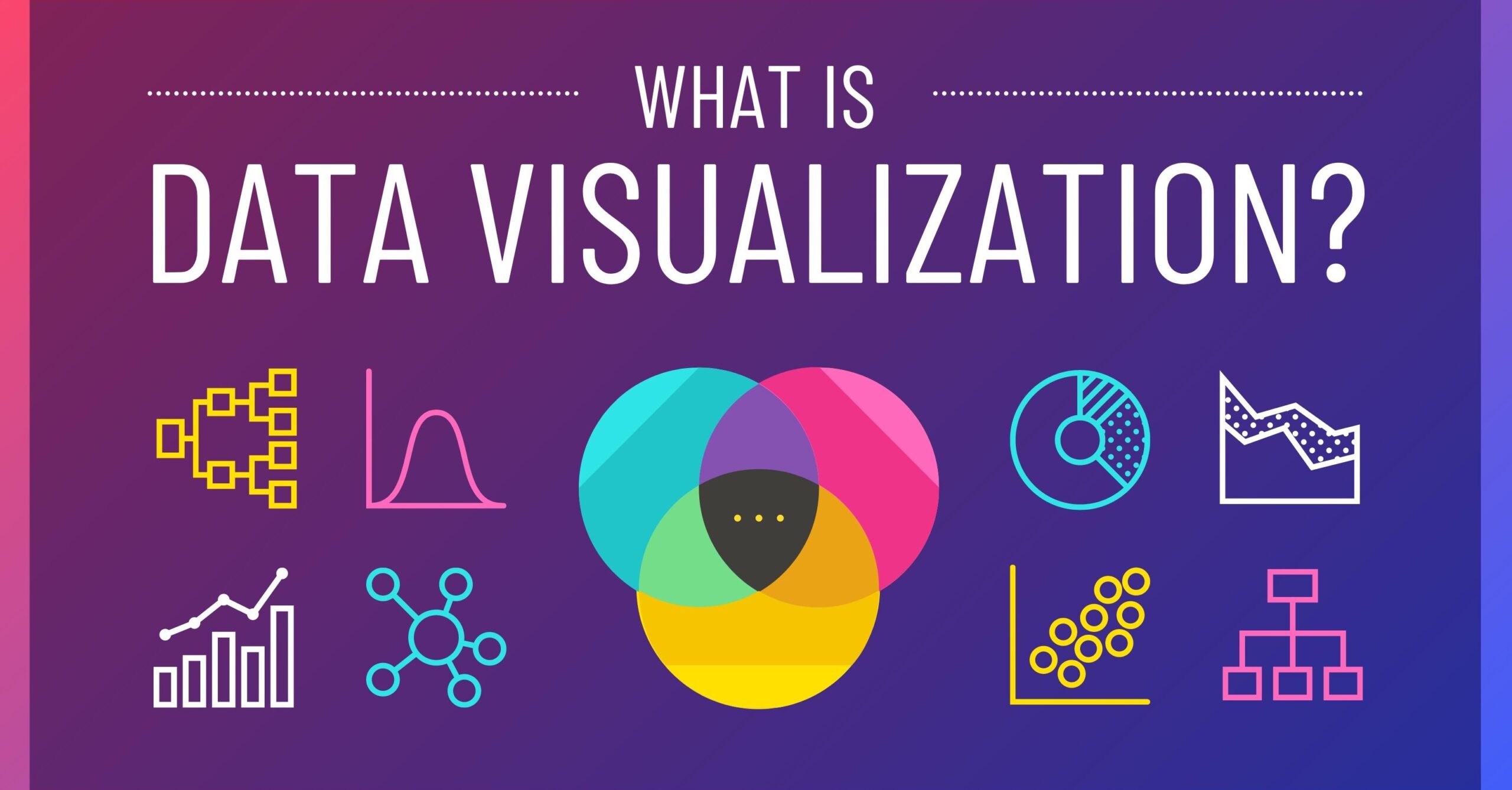
Choosing the Right Visualization Type
Visualizations come in various forms, each suited for different types of data and messages. Understanding the different visualization types and selecting the most appropriate one can significantly enhance the effectiveness of your communication. Consider the following when choosing a visualization type:
1. Bar Charts: Ideal for comparing categorical data or displaying frequency distributions. Use horizontal or vertical bars to represent different categories or groups.
2. Line Graphs: Great for showing trends or changes over time. Connect data points with lines to depict continuous data variations.
3. Scatter Plots: Effective for visualizing relationships between two numerical variables. Represent data points as dots on a graph, with each dot’s position determined by its corresponding values.
4. Pie Charts: Useful for displaying proportions or percentages of a whole. Split a circle into sectors, with each sector representing a category and its size indicating the proportion.
5. Histograms: Helpful for illustrating the distribution of continuous data. Group data into bins or intervals, and represent the frequency or count of observations in each bin with vertical bars.
When choosing a visualization type, consider the characteristics of your data, the story you want to tell, and the audience you are targeting. Experiment with different types and select the one that best represents your data and effectively conveys your message.
Designing Effective Visuals
To ensure your visualizations are effective, it is essential to follow certain design principles and make thoughtful choices regarding layout, color, and readability. Here are some tips for designing effective visualizations:
1. Simplicity: Keep your visualizations simple and focused. Avoid cluttering the visual with unnecessary elements that may distract from the main message. Use clear and concise labels and avoid overcrowding the visualization with data points.
2. Clarity: Aim for clarity in your visualizations by choosing appropriate scales, axes labels, and titles. Ensure that the visual elements are easy to interpret and understand. Consider adding annotations or captions to provide additional context or highlight important points.
3. Consistency: Maintain consistency in design across your visualizations. Use a consistent color palette, font style, and layout to create a cohesive look and feel. Consistency helps establish a visual identity and improves the overall readability of your visualizations.
4. Color Palettes and Fonts: Choose colors that are visually appealing and distinguishable. Consider using color schemes that are accessible to colorblind individuals. Similarly, select fonts that are easy to read and appropriate for the context of your visualization.
5. Labels, Legends, and Annotations: Use labels and legends to provide clarity and context to your visualizations. Clearly label axes, data points, and categories. Include legends to explain color coding or symbols used in the visual. Annotations can be used to call attention to specific data points or provide additional information.
Enhancing Interactivity
Interactive data visualizations can greatly enhance the user experience and allow viewers to explore the data in more depth. Here are some tips for incorporating interactivity into your visualizations:
1. Tooltips: Add tooltips that display additional information when users hover over data points or elements. Tooltips can provide details such as specific values or descriptions, offering more context without cluttering the visualization.
2. Filters: Incorporate filters to allow users to selectively view specific subsets of data. Filters can be based on different variables or categories, enabling users to focus on the data that is most relevant to their interests or analysis.
3. Drill-Down Features: Implement drill-down functionality that allows users to delve into more detailed information. This feature is particularly useful when dealing with hierarchical data, enabling users to navigate from an overview to more specific levels of detail.
4. Balance Interactivity and Simplicity: While interactivity can enhance the user experience, be mindful not to overwhelm your audience. Strike a balance between providing interactive elements and maintaining simplicity. Ensure that the core message of your visualization remains clear and accessible, even without interacting with additional features.
Conclusion:
In conclusion, this blog discussed several key best practices in data visualization that can greatly enhance the impact and informativeness of your visualizations. By following these guidelines, you can effectively communicate complex information, highlight patterns and trends, and engage your audience.Firstly, it is important to choose the right chart or graph type for your data. By selecting a visualization that aligns with the nature of your data, you can present information in a clear and intuitive manner.